Civ 7's Deluxe Edition launched just yesterday, and the internet is already buzzing about its UI and other shortcomings. But is the online outcry justified? Let's delve into the game's interface and determine if the criticism is accurate.
← Return to Sid Meier's Civilization VII main article
Is Civ 7's UI as Bad as They Say?
With Deluxe and Founder's Editions players experiencing Civ 7 for barely a day, criticism, especially regarding the UI (and missing quality-of-life features), is already rampant. While it's easy to join the chorus of complaints, let's objectively assess whether the UI truly deserves the harsh judgment. The best approach? A piece-by-piece breakdown against the standards of a good—or at least functional—4X interface.
What Makes a Good 4X UI?
Defining an objectively "good" 4X UI is tricky. A game's context, style, and goals significantly influence UI design, making universal rules inapplicable. However, visual design principles highlight common elements found in successful 4X UIs. Let's use these principles to evaluate Civ 7's interface.
Clear Information Hierarchy

A clear information hierarchy prioritizes accessibility and gameplay relevance. Essential resources and mechanics should be prominent, while less crucial features remain easily accessible. The UI shouldn't display everything at once, but it must organize information logically.
Against the Storm offers a strong example. Building right-click menus feature tabbed information, prioritizing common actions (worker assignment, production) in the default tab and relegating less frequent functions (inventory, Rainpunk system) to subsequent tabs.
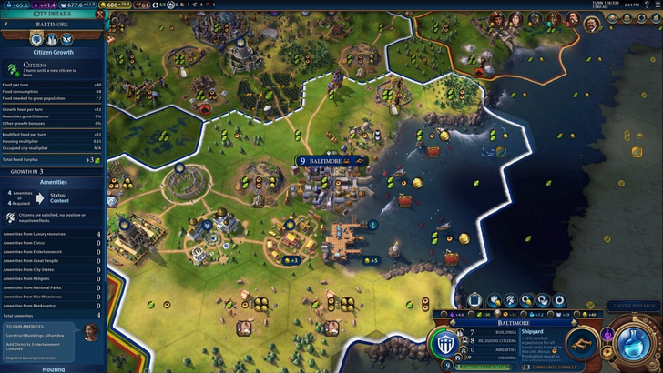
Let's examine Civ 7's resource summary. It displays resource allocation, neatly separating income, yields, and expenses via dropdowns, with city-by-city breakdowns. The structure is decent and collapsible. However, it lacks granular detail. While total resource production from Rural Districts is shown, specific district or hex origins aren't. Expense breakdowns are also limited.
In short, Civ 7's resource UI functions adequately but could benefit from increased specificity.
Effective and Efficient Visual Indicators
Effective visual indicators use icons and graphics to convey information quickly, minimizing reliance on text. Symbols, colors, and overlays efficiently communicate data.
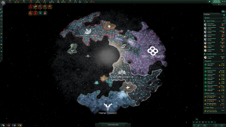
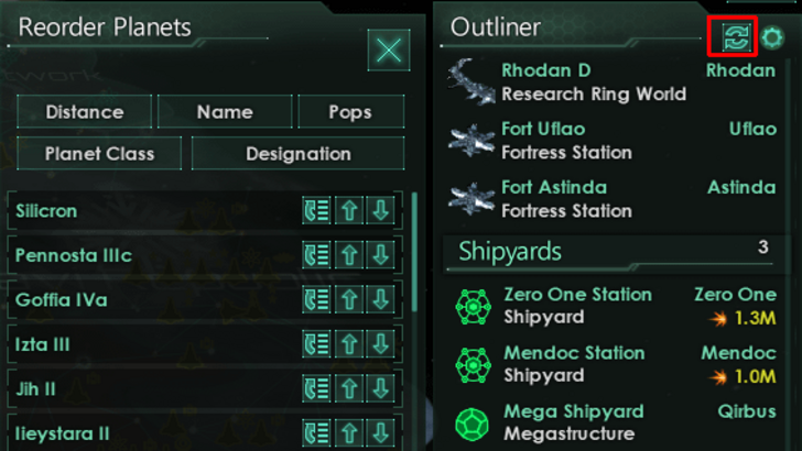
Stellaris, despite its cluttered UI, showcases effective visual indicators in its Outliner. At a glance, players understand ship status (transit, scanning, etc.), and colony needs are instantly visible via icons.
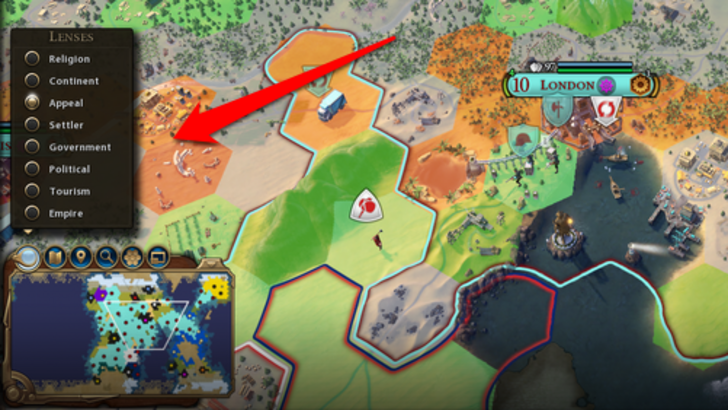
Civ 7 utilizes iconography and numerical data for resources, featuring a tile yield overlay, settlement overlay, and settlement expansion screen. However, the absence of certain Civ 6 lenses (appeal, tourism, loyalty) and customizable map pins is criticized. While not terrible, improvements are needed.
Searching, Filtering, and Sorting Options
In complex 4X games, search, filtering, and sorting options are crucial for managing information overload. Search bars, visual filters, and sort-by buttons streamline navigation.
Civ 6's powerful search function allows players to locate resources, units, and features on the map, even linking to the Civilopedia.
This search functionality is absent in Civ 7, a significant usability drawback, especially given the game's scale. Its omission is a major flaw, hopefully addressed in future updates, ideally with enhanced Civilopedia integration.
Design and Visual Consistency
UI aesthetics and cohesiveness are critical. An unappealing UI can negatively impact the overall experience.
Civ 6's dynamic cartographical style seamlessly integrates with its aesthetic, creating a cohesive and visually appealing experience.
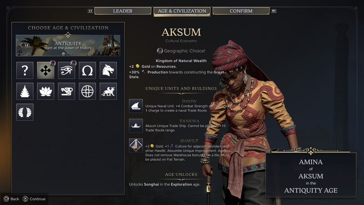
Civ 7 adopts a minimalist, sleek design, prioritizing elegance over vibrant visuals. The black and gold color scheme is sophisticated, but the less visually striking approach leads to mixed reactions. While not inherently bad, the subtler thematic direction may not resonate with all players. Visual design is subjective, ultimately.
So What’s the Verdict?
Not the Best, But Undeserving of Excessive Criticism

Civ 7's UI, while not perfect, doesn't deserve the overwhelmingly negative reception. Key features are missing, particularly the search function, but this isn't game-breaking. Compared to other issues, the UI's shortcomings are minor. While it lags behind other visually impressive 4X UIs, it has strengths. Future updates and player feedback could significantly improve it. The overall game's strengths compensate for the UI's imperfections.
← Return to Sid Meier's Civilization VII main article
Sid Meier's Civilization VII Similar Games