Exploring the Evolution of Kirby's Western Image: From "Angry Kirby" to Global Consistency

This article delves into the fascinating story behind Kirby's differing appearances in the US and Japan, as revealed by former Nintendo employees. We'll examine Nintendo's localization strategies and their evolution towards a more globally consistent approach.
The "Angry Kirby" Phenomenon: A Western Marketing Strategy
Kirby's portrayal in Western markets often featured a tougher, more determined look—a stark contrast to his typically cute Japanese counterpart. Former Nintendo Localization Director, Leslie Swan, explained that while cuteness resonates universally in Japan, a more "tough" image was believed to better appeal to American tween and teen boys in the early 2000s. Shinya Kumazaki, director of Kirby: Triple Deluxe, corroborated this, noting that while cute Kirby drives Japanese engagement, a more battle-hardened Kirby resonated more strongly in the US market. However, he also pointed out that this wasn't a universal rule, citing Kirby Super Star Ultra's consistent box art across regions.
Marketing Kirby as "Super Tuff Pink Puff"
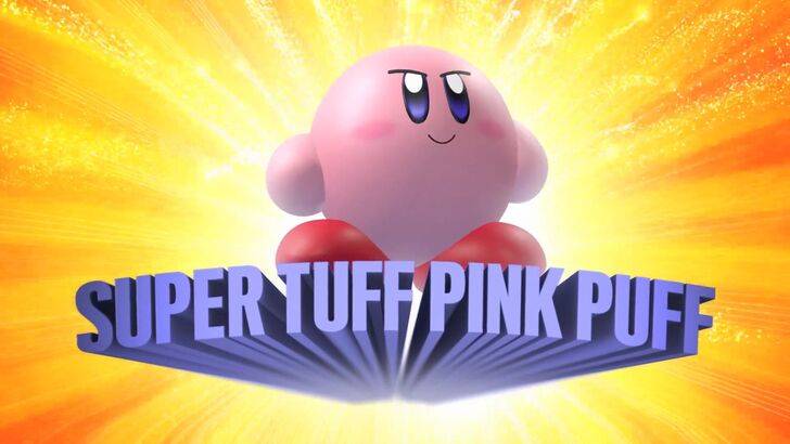
Nintendo's marketing actively sought to broaden Kirby's appeal, particularly among boys. The "Super Tuff Pink Puff" branding for Kirby Super Star Ultra (2008) exemplifies this strategy. Former Nintendo of America Public Relations Manager, Krysta Yang, highlighted Nintendo's desire to shed its "kiddie" image during that era, emphasizing the perceived negative impact of such a label. This led to a conscious effort to showcase Kirby's combat abilities, aiming to attract a more mature audience. While recent marketing has focused less on personality and more on gameplay, the perception of Kirby as "cute" persists.
Regional Differences in Localization
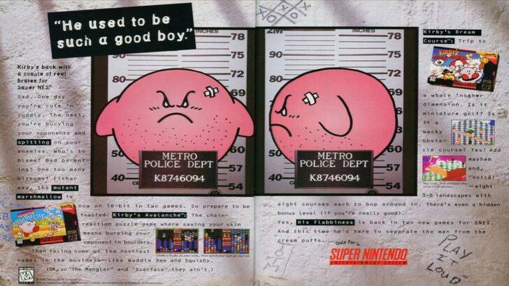
The divergence in Kirby's localization began early. A 1995 "Play It Loud" ad featuring a mugshot-style Kirby is a prime example. Subsequent game box art frequently displayed Kirby with sharper features and more intense expressions (e.g., Kirby: Nightmare in Dream Land, Kirby Air Ride, Kirby: Squeak Squad). Even the color palette was altered; the original Kirby's Dream Land (Game Boy, 1992) featured a desaturated Kirby in the US, a choice attributed to the Game Boy's monochrome display. This early decision, coupled with the perceived need to appeal to a broader audience, solidified the trend of a tougher Kirby in the West. Recently, however, a more consistent global approach has emerged, with Kirby's image fluctuating between serious and playful across all regions.
A Shift Towards Global Consistency
Swan and Yang both agree that Nintendo has adopted a more globalized approach to marketing and localization. Closer collaboration between Nintendo of America and its Japanese counterpart has led to greater consistency. The company is actively moving away from regionally specific variations, aiming for a unified brand image. While this offers brand consistency, Yang acknowledges a potential downside: a homogenization that might lead to less creative, risk-averse marketing. However, the increasing familiarity of Western audiences with Japanese culture may be a contributing factor to this shift.